AeroFarms
PACKAGING - BRANDING
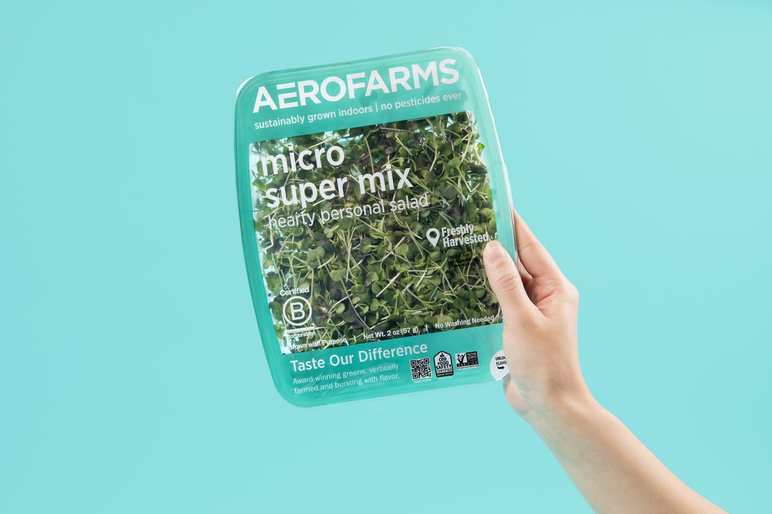
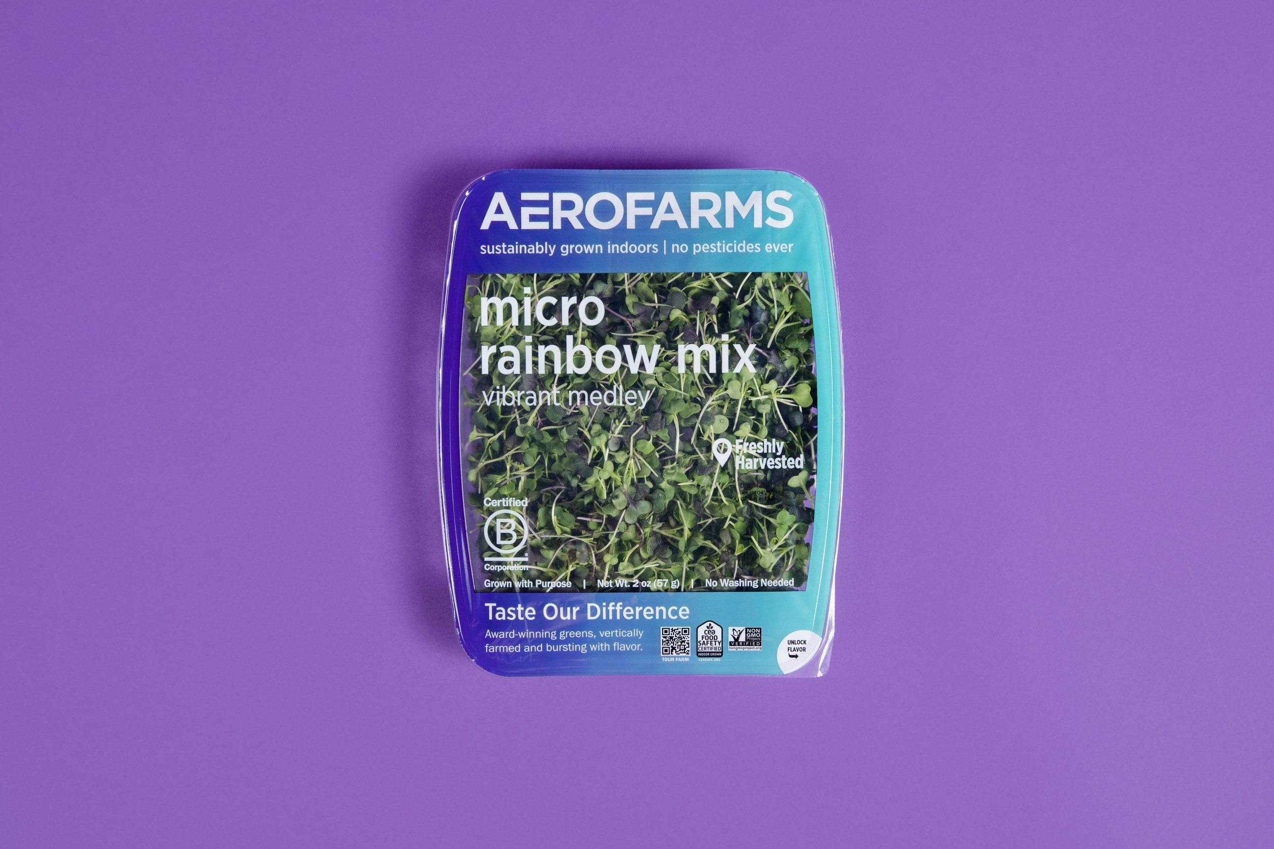
My driving concept for this design was to visually express the breadth of flavors and varieties grown inside their indoor vertical farms. I created the AeroFarms FlavorSpectrum™ concept, which pairs a color to a specific tasting note. Across the leafy greens packaging line, you'll find that the cool blue colors represent the sweet and mellow notes, while the intense reds represent bold and zesty flavors. This tool allows AeroFarms to lead with their key differentiator on shelf - flavor! Additionally, this breakthrough packaging design boasts the largest clear window in the entire packaged salads category. As a result, the leafy greens are showcased, allowing the product to be the hero to signal the ultimate in freshness and flavor. Major consumer attributes like sustainably grown indoors, no pesticides ever, locally grown, no washing needed, and non-GMO are highlighted in a clean presentation for the consumer, and AeroFarms’ expertise in flavor is brought to life through its descriptive product tasting notes and its “Taste Our Difference” invitation to the consumer. AeroFarms’ leadership in authenticity and transparency (also represented by the clear window) is reinforced by the grown with purpose messaging and by the logo for Certified B Corporation, that provides a scorecard on both environmental and societal factors. Since launch, the AeroFarms FlavorSpectrum™ was awarded best brand concept at the 2022 Vertical Farming Awards and the AeroFarms Brand has won the Fast Company 2021 Brands that Matter and 2021 CEA Brand Excellence Awards.


